Jarosch Bakery Brand Rebrand Design
Jarosch Bakery is an old-school, family-run shop offering a wide array of cookies, specialty cakes & donuts since 1959 and its brand honors Jarosch Bakery’s rich history through its reflection.
The challenge is to redesign Jarosch Bakery logo and apply them to different forms of applications like signage, packaging, etc. A brand manual is designed to guide the business in how to use their new branding
Original Logo
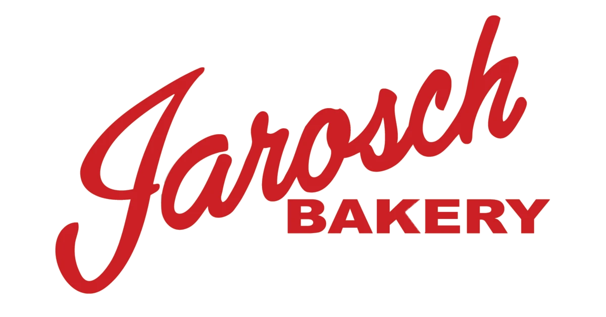
Rebranded Logo

To the drawing board
Jarosch Bakery is a local business since 1959, and it is a popular community stapel. I wanted to incorporate “since 1959” as they take great pride in their long history in Elk Grove Village. Since it it’s a bakery, I drew inspiration from raising bread, pies and cakes.
Hand-drawn Sketches

Digital Sketches

Digital Sketches

Logo Trials
The brand is based on a vintage theme. The oval encasing the wordmark logo reflects this theme. The name shape reflects a loaf of bread raising as it bakes. Font is called Angle. The dash marks mimic pie score marks.
Attempt #2 was chosen to be the base of the final logo. I took the 5-6 dash marks off each side and reduced the name. “Since 1959” was raised to align in the center underneath the score marks.
Attempt 1

Attempt 2
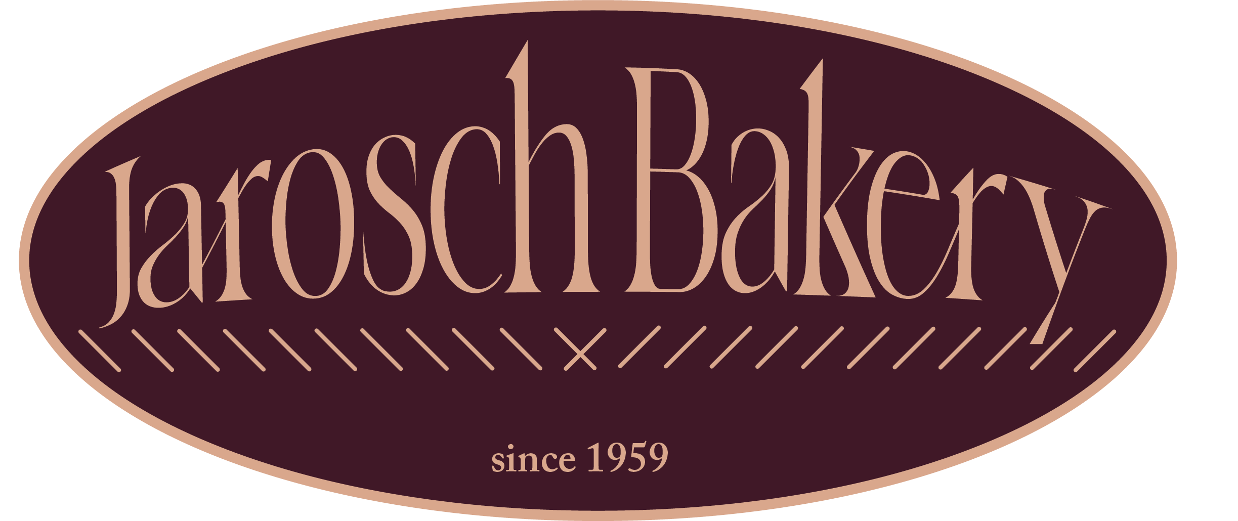
Attempt 3

Attempt 4

Color Palette
The brand color palette is inspired by our popular Rum Torte Cake. It is one of Jarosch Bakery top selling cakes, and it is my personal favorite cake.

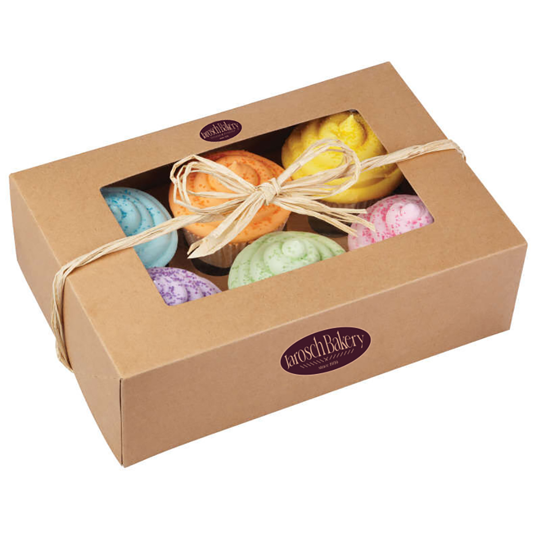
Applications – Packaging


Applications – stationary


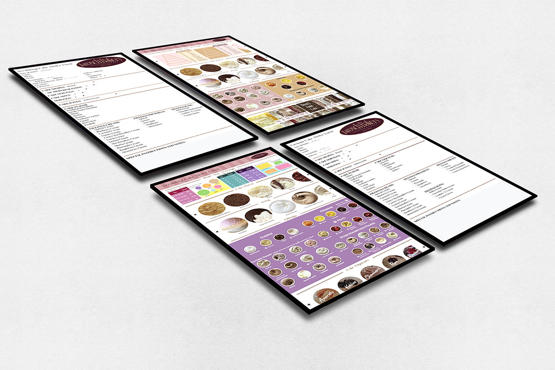
Applications – digital interface forms
Translated the physical paper form into a digital form through a tablet. This is a mockup for custom cake order forms.

Applications – Signage


Applications – digital interface Website


Applications – Social Media

