3 Ws of Covid Website
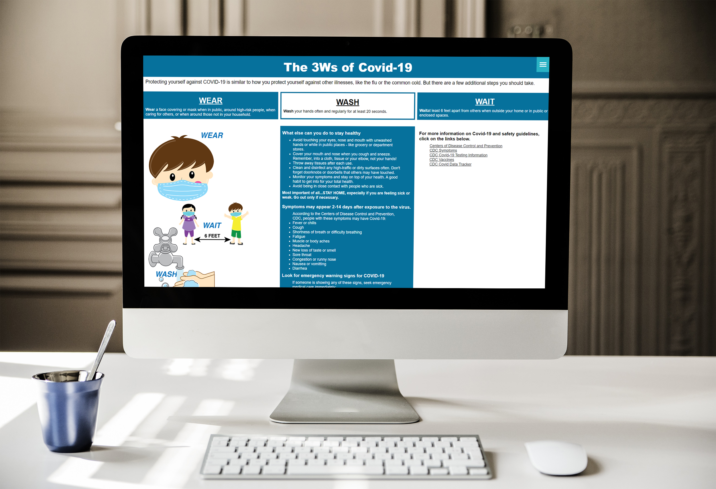
Challenge: To create an informative website with child-friendly graphics and in-depth information and links about Covid-19.
Preliminary Sketches
Main Goals: to incorporate cute, friendly graphics with informative details on covid-19 safety protocols. Aimed towards both adult and child users.
– Graphics are interactive in some form – Main audience are children
– Use the CDC website as reference for facts and guidelines. Information on site is aimed for Adult users.
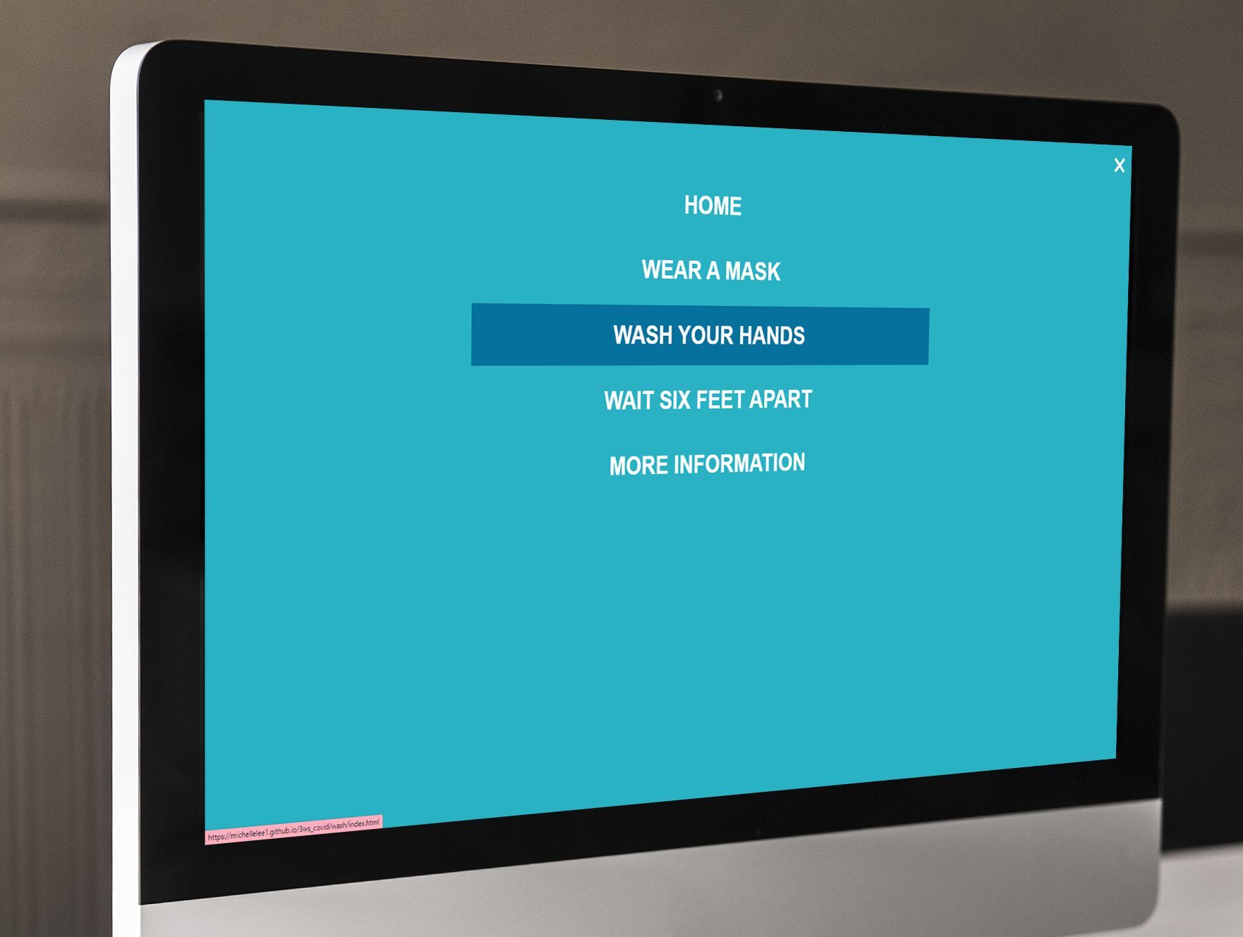
– Want to experiment javascript with a Hamburger Menu as navigation for website

Wireframes
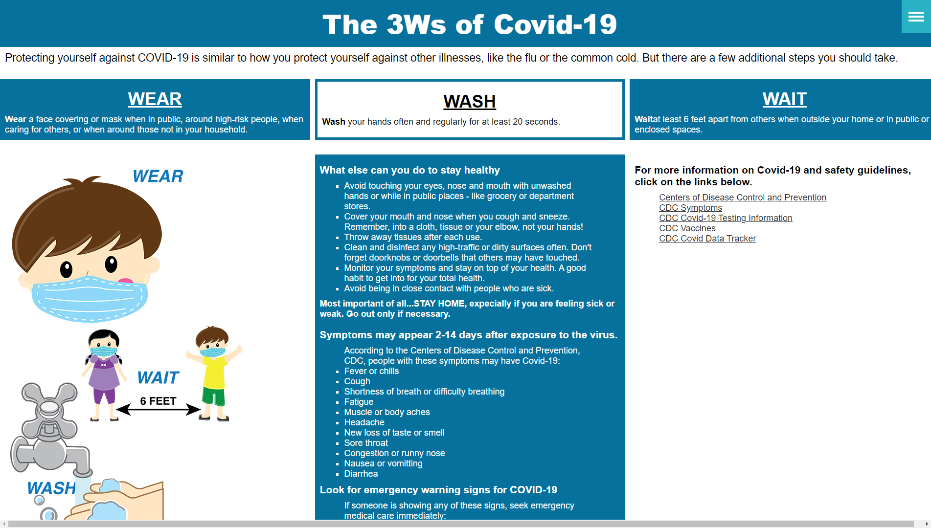
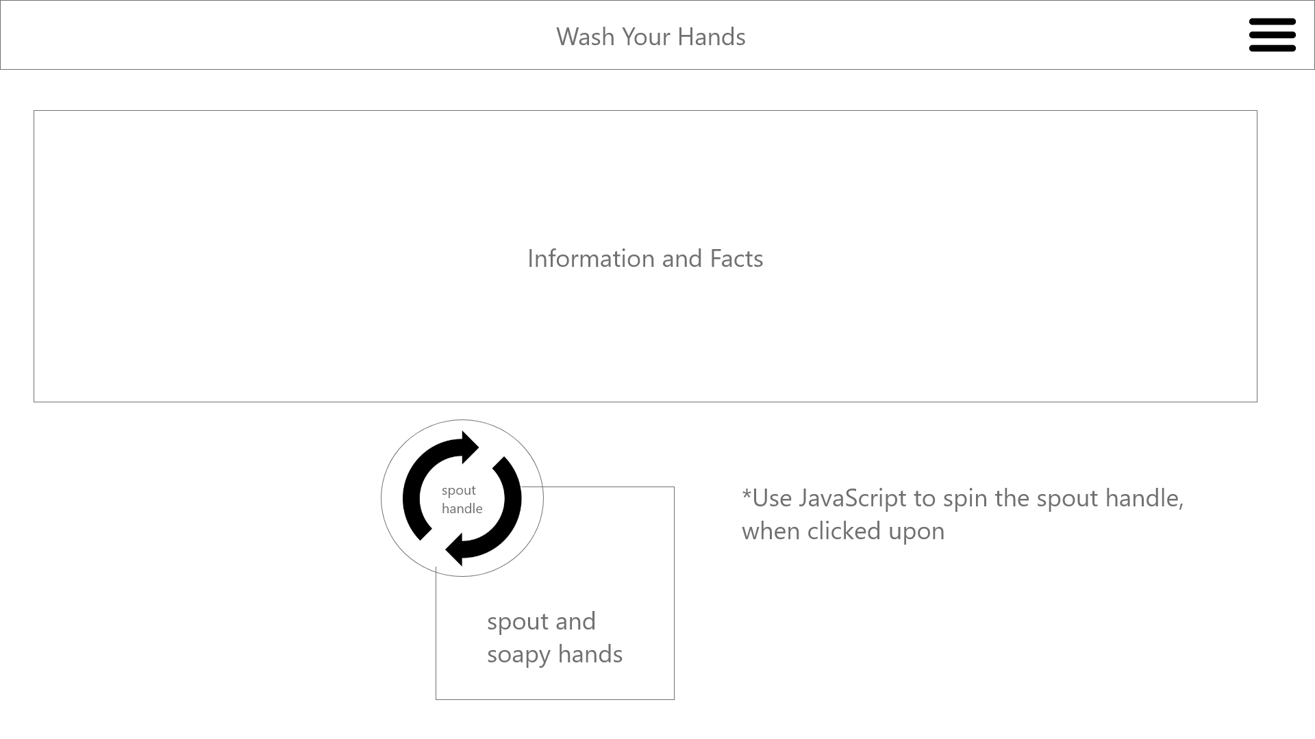
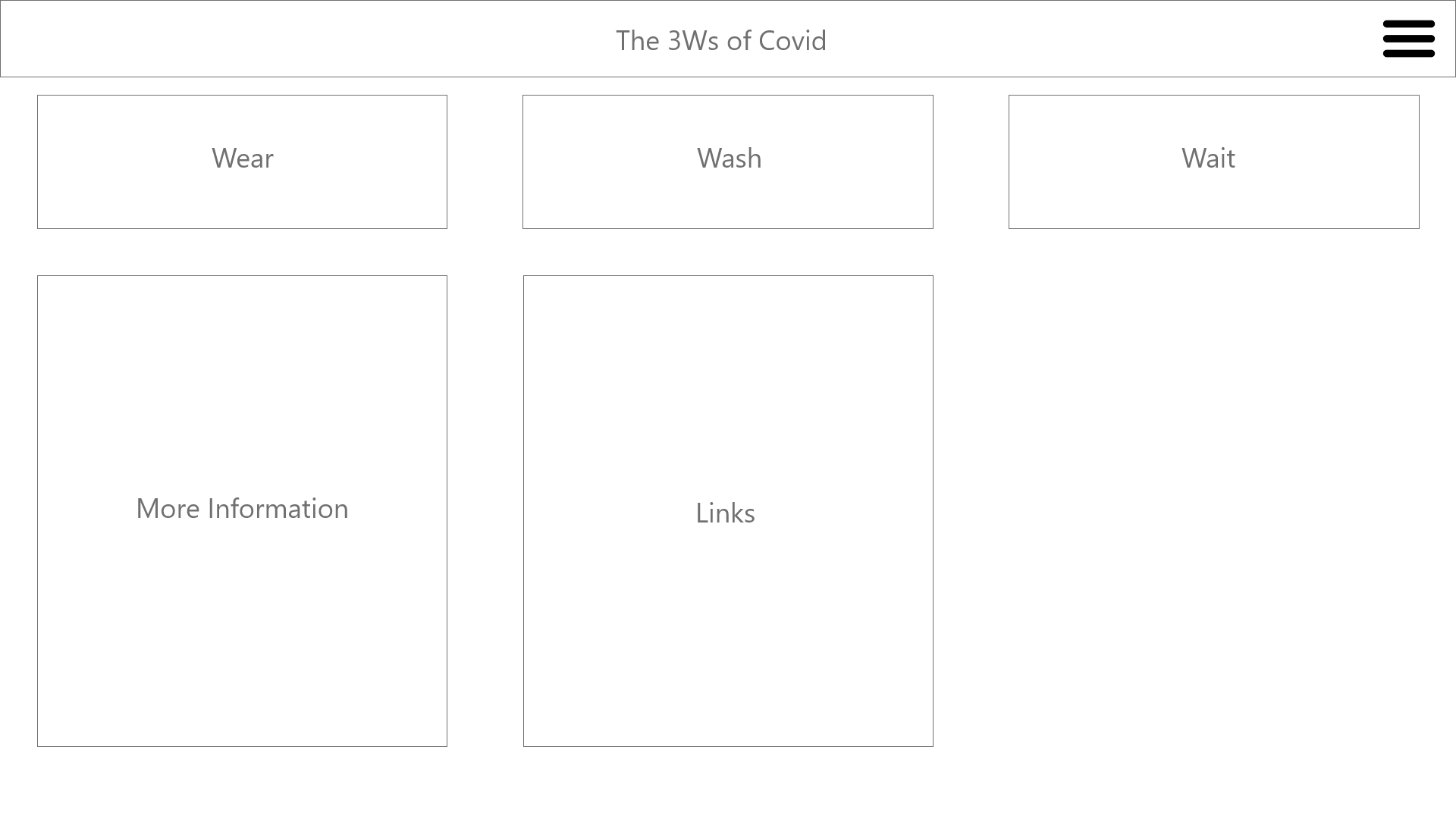
The layout of each page is simple.
WASH, WEAR, and WAIT pages will not be so long that the user has to scroll. Just enough information for adults to read, but the interactive graphi is within the intitial top page.
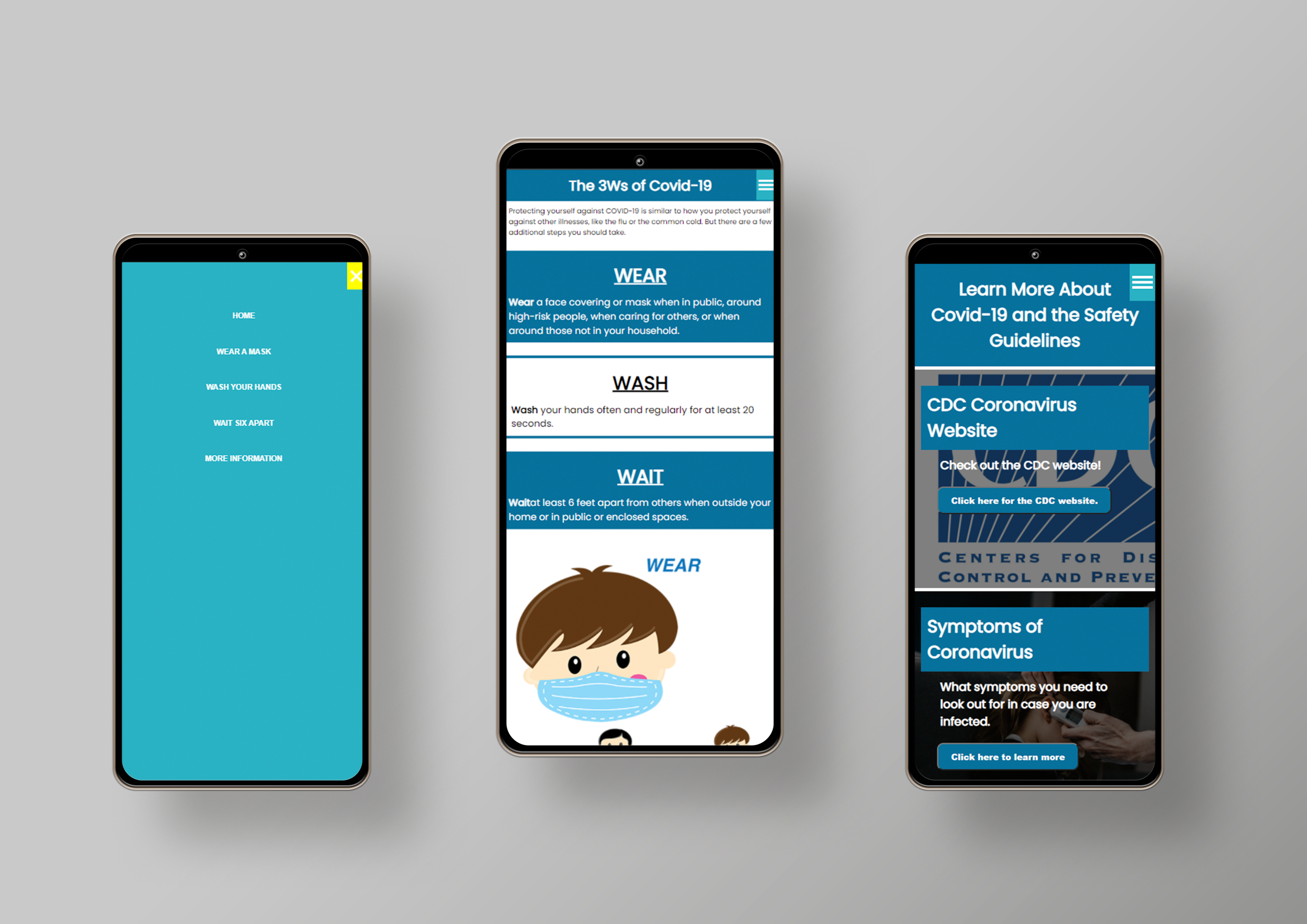
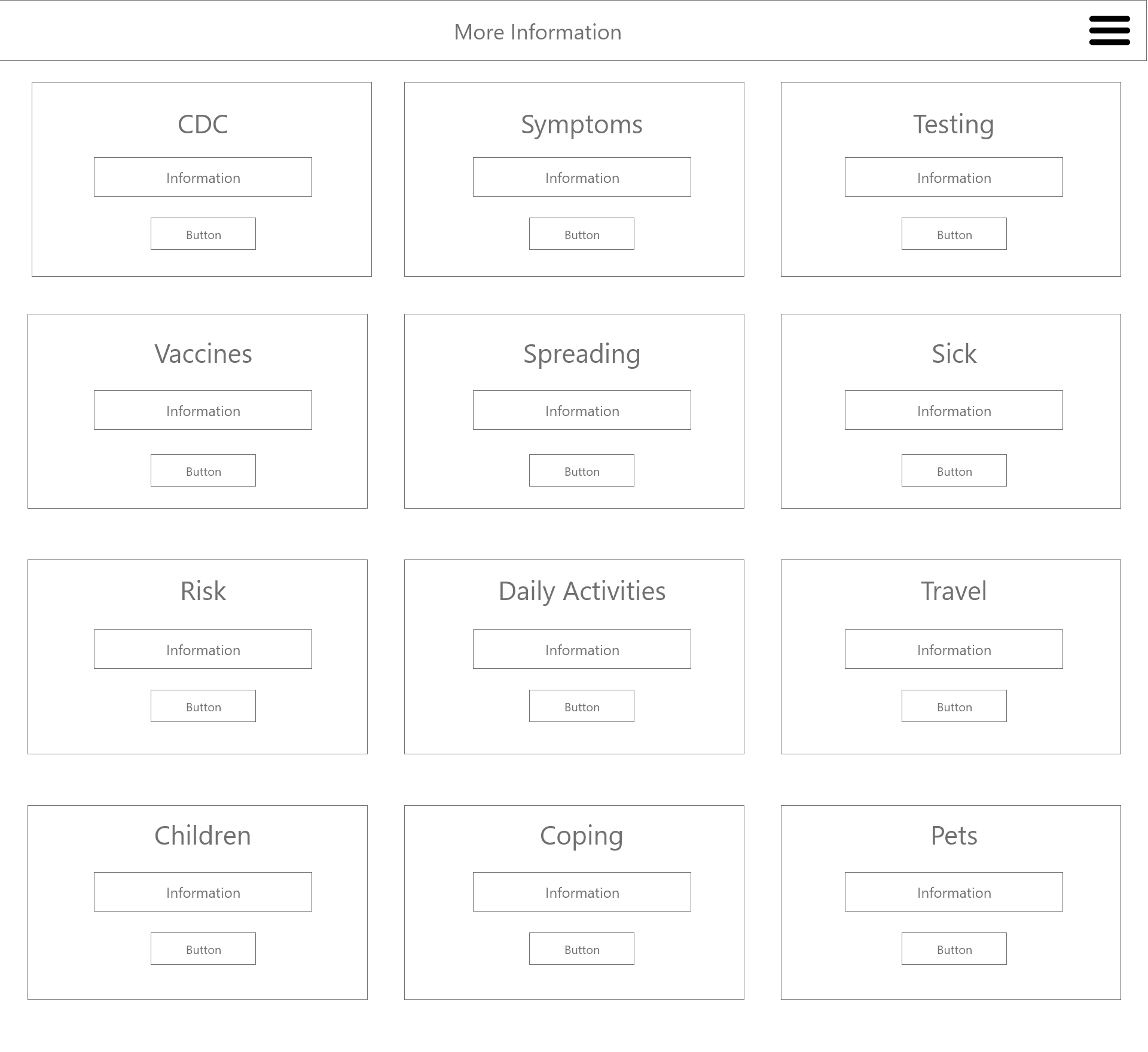
More Information will require scrolling as it contains 12 images in the gallery. Only, title and link to CDC page, maybe a brief summary of category.


Color Themes

Blue and Yellow represent colors of trust and safety, which is may be helpful to reassure users as they read and browse through the site
Graphics

Illustrated graphics with solid matte colors. Appealling to kids while convey the message to practice safety.
Graphics tested and kid approved!
Problems and Solutions

Wear A Mask Animation
Problem:
I orginally used absolute display css to overlay the mask over the face. However, the animation of the mask’s movement was ny syncing, especially the screen switched from desktop to moble view.
Solution:
I converted the graphic in to an animated gif file, made in Adobe Photoshop, and then timed the animation through css3.
Before
More Information Page - Overlay and Visible Text
Problem:
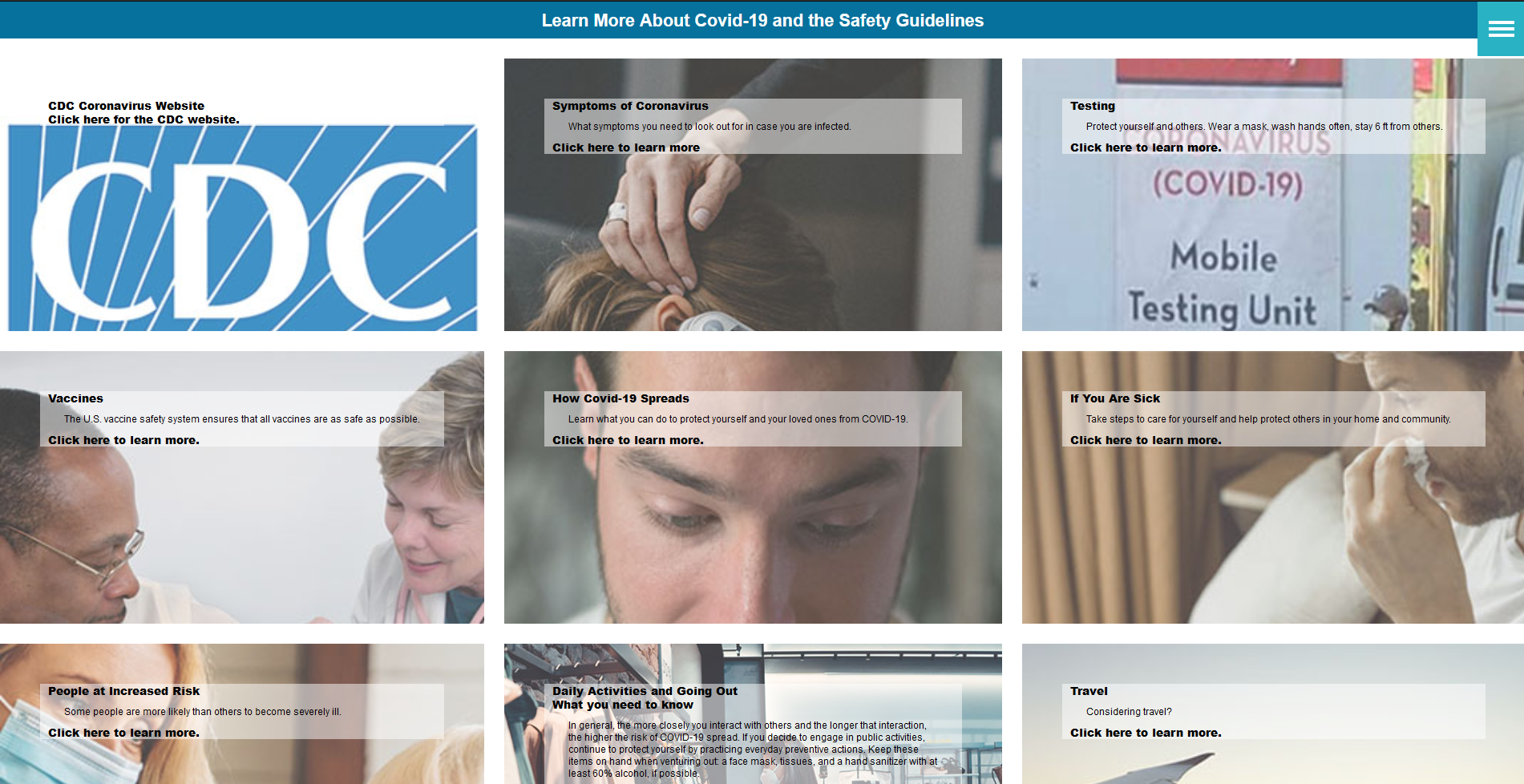
I put a white background with a 50% opacity behind the text within each box category. The textbox looked out of place against the background image.
The background image only captured the middle of the image and everything else was cut off, which called the images’ relativity to the category into question.
Solution:
The text was changed to white against a full black overlay of the background image through CSS3 and I resized the images so they would fit better within the style box.
After

Mockups