Loreal rebrand design
The main goal for my rebrand experiment was to explore five different forms of logo typologies: wordmark, letterform, emblem, pictorial, and abstract. I chose to experiment on the brand, LOREAL. The task is to reform and reinvent a new brand for the company through each form.
Challenge: Examine and come up with a new design for a brand, considering a theme or a message you’d like the new logo to convey. Create five different types of logo marks: Wordmark, Pictorial, Letterform, Emblem, and Abstract.

Loreal Original Logo
Like: San serif, geometic letters give it a modern, clean aesthetic.

Loreal Rebranded Logo
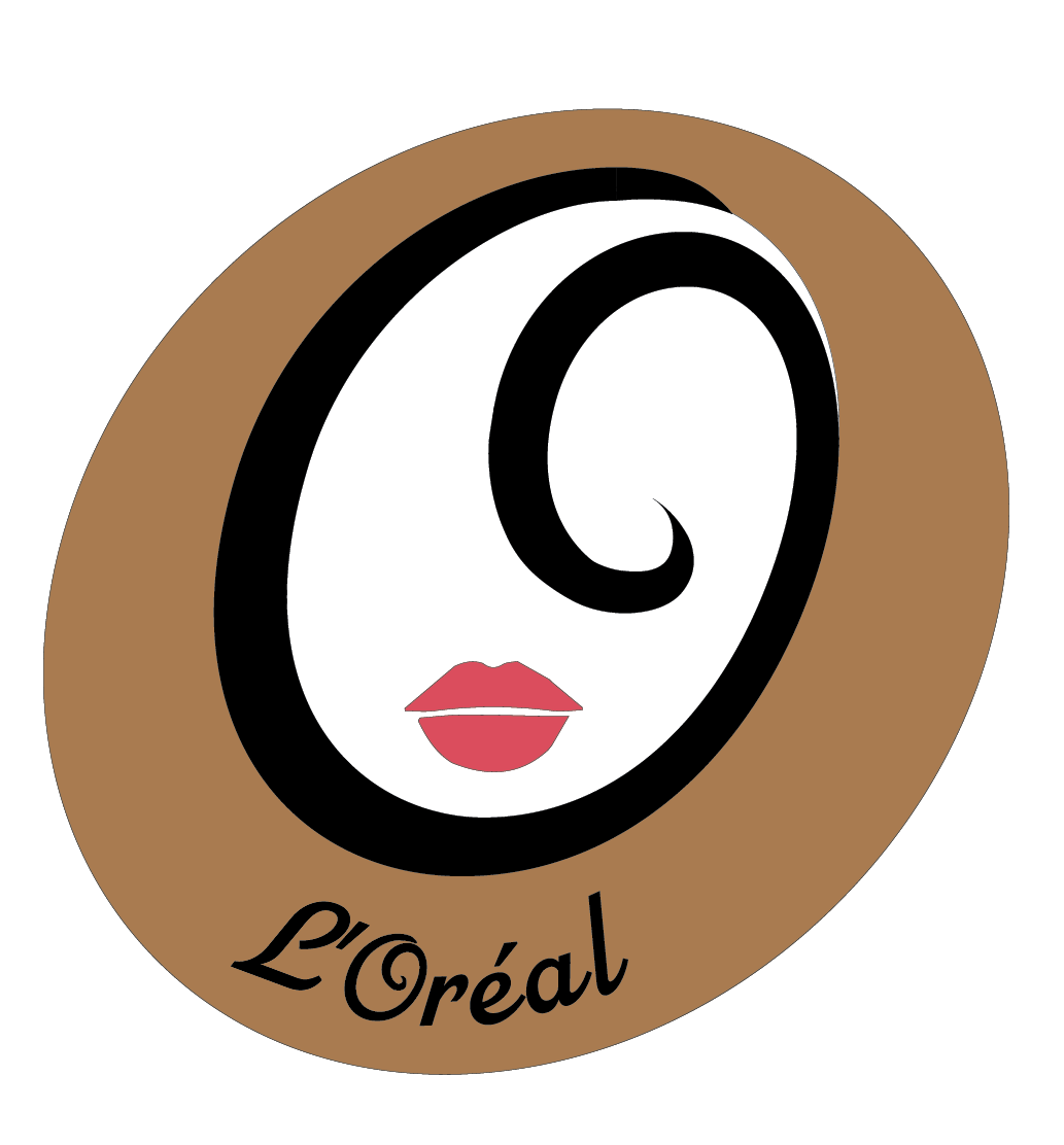
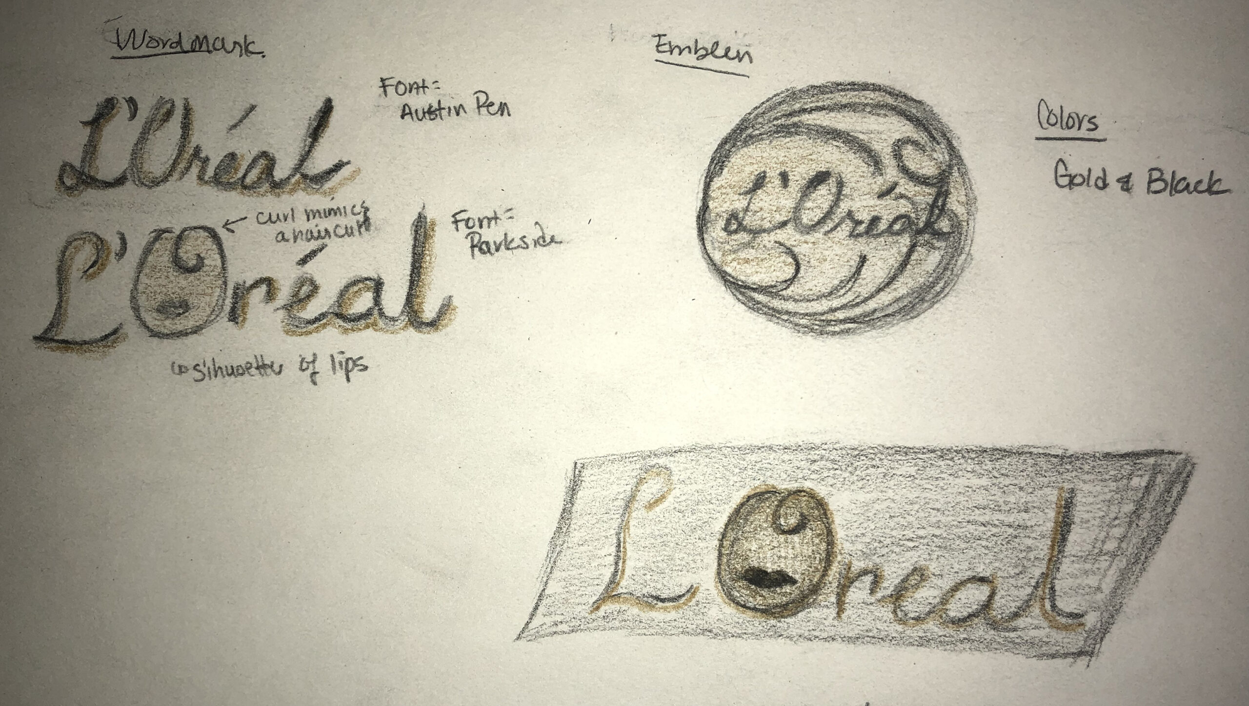
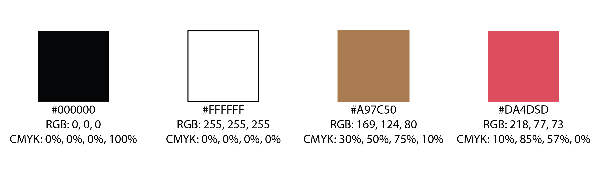
The direction, I took for LOREAL, was to go back to its humble beginnings. The first product was a hair dye, so I wanted to new brand to resemble voluminous hair with luscious curls. I chose a script typeface as the swirls mimic flowing hair. A key point is found in the “O” as a curly-q adds a whimsical, luscious form, which makes it the distinguish mark for the new brand. The gold, white and black color palette is a timeless theme, which elevates the brand logo.
Ideation
Preliminary Sketches

Color Palette
Ideation
Drafts

Emblem Iteration
Tested to see how the name should lay within the emblem:
larger, bolder with a curvature that follows the oval or smaller and straight to draw more attention to the face.

Abstract Iteration #1
For the abstract logo mark, I wanted it to represent luscious hair strands and to incorporate the oval mark from the emblem mark.
I didn’t link the circle and the strands didn’t read well with my peers.

Abstract Iteration #2
Since the strands looked more like a double helix, I changed it to 1 strand of hair that had a nice curly bounce to its end.
But the black strand alone was missing something.

Abstract Iteration #3
I added 3 stands, 2 black and 1 blonde, and laid them to a similar format as version #1
But when tested, people’s response to it were negative. Spacing was too wide between each strand.
Final Drafts
Final Emblem logo
I went with the first version: the larger and bolder name that followed the curve.
Reason: The name of a brand is it’s mark to familiarize people with the new design. In the initial stages of reintroducing the new face, the name needs to be noticable. Eventually, as the rebrand design is more recognizable, then focus can be placed on other logo marks without the name attached to it.
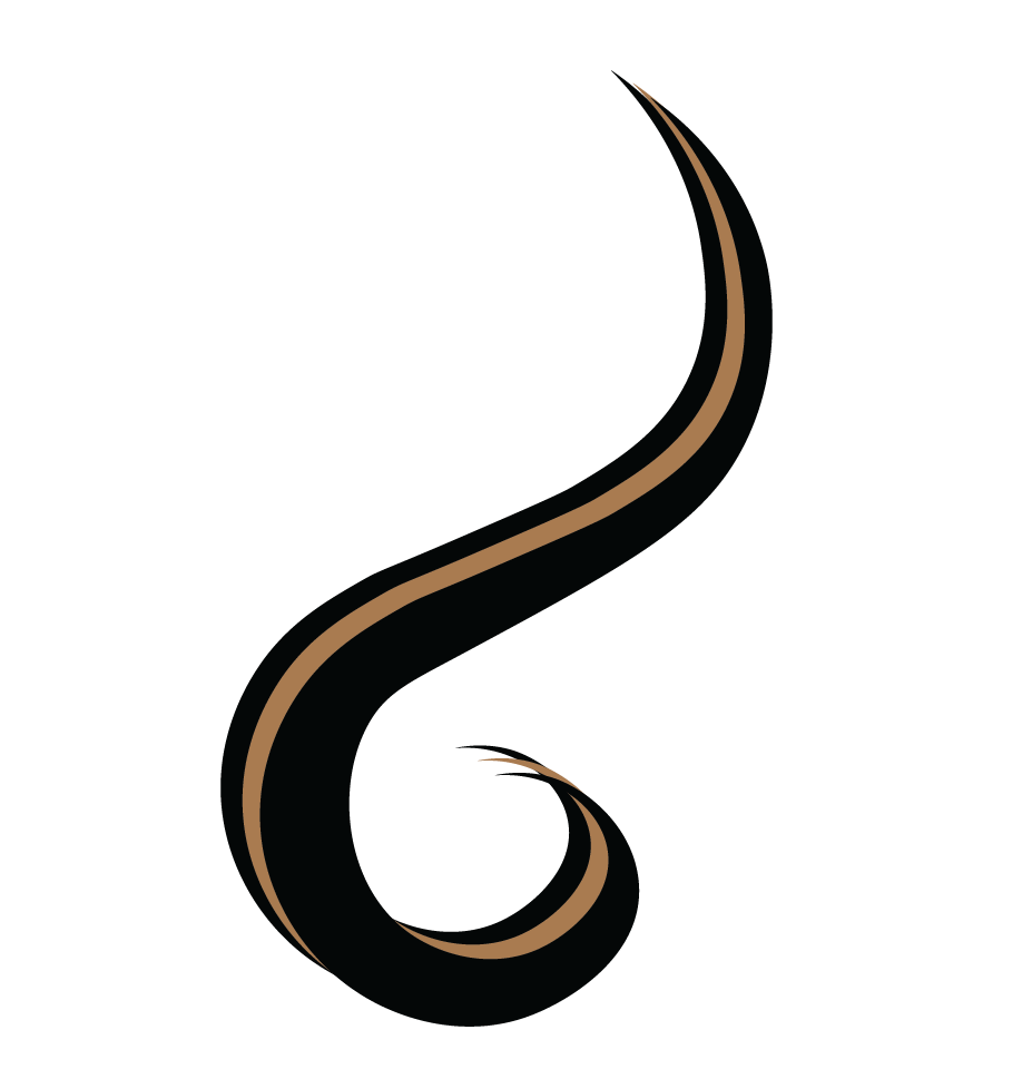
Final Abstract logo
I grouped the 3 strands together.
Reason: When grouped together in a bundle, it looks like a lushious ponytail. The top tip is together, but the bottom ends are still separated enough to tell the user that it is 3 strands put together. It is visually more pleasing.
Wordmark logo
Pictorial logo

Letterform logo
